
Jul 11, 2026
By Victor Teran
How Q.AI Took Activation From 38% to 67% in One Onboarding Fix
Q.AI came to us with a problem most funded founders will recognize: a growing user base and a retention curve nobody could explain. Acquisition worked. The product was strong.
Case Study
Activation
Onboarding
And still, too many new users arrived, looked around, and never came back, while the team debated theories without data to referee them.
One growth audit later, the theories were replaced by a diagnosis: onboarding was breaking at specific, identifiable screens. We measured activation in Amplitude, against a market where only 4.6% of apps reach $10K monthly revenue in two years. We redesigned those screens based entirely on what the data said. Activation rose from 38% to 67%, onboarding completion rose 68%, and support tickets fell 73%. Q.AI ran for two more years and was acquired by Forbes. This is the anatomy of that engagement, written as a template you can run on your own product.
Key takeaways
Instrument first, judge later: a funnel over the new-user path, session replays at the break point, and a refusal to redesign anything until the data pointed somewhere.
Only the implicated screens, redesigned to remove the observed stumbles: value earlier, decisions fewer, next steps unmistakable.
Activation 38% to 67%, onboarding completion +68%, support tickets −73%. The numbers are specific to Q.AI; the method is not.
What did the diagnosis actually involve?
Instrument first, judge later: a funnel over the new-user path, session replays at the break point, and a refusal to redesign anything until the data pointed somewhere.
The first weeks contained no design work at all. Their stack was Amplitude, and the tool never matters: what went in was a funnel across the new-user journey: signup, the onboarding steps, first core action, return session. The funnel did what funnels do: it showed the cliff, the onboarding steps where survival fell hardest.
Then came the part that turns a chart into a diagnosis: session replays filtered to new users who hit those steps and left. Watching real people fail is humbling and clarifying in equal measure. The stumbles were concrete: moments where the flow demanded effort before showing value, screens where the next step was not obvious, a sequence that made sense to the team and not to a stranger.
The output of the diagnosis phase was deliberately small: a shortlist of specific screens, each with an observed failure attached. No moodboards, no full-product critique. A work order.
FREE GUIDE
The 4 product leaks costing you growth
A short audit guide for founders. Find the four places your product leaks revenue, and what to fix first.
What changed in the redesign?
Only the implicated screens, redesigned to remove the observed stumbles: value earlier, decisions fewer, next steps unmistakable.
The redesign touched the onboarding flow and the key screens around it, and nothing else. The principles were unglamorous. Show value before asking for effort. Cut every field and decision that could be deferred. Make the next action the loudest thing on the screen. Let a new user reach the product's core value in their first session, not their third.
Because the changes were narrow, attribution stayed clean. The rest of the product was held constant, so when the numbers moved, we knew why. This is the quiet advantage of surgical work over sweeping redesigns: the experiment is legible, and what you learn compounds into the next fix.
The measurement plan was agreed before shipping: same funnel, same steps, new cohorts against old. No cherry-picking windows, no switching metrics after the fact.
What were the results, and what generalizes?
Activation 38% to 67%, onboarding completion +68%, support tickets −73%. The numbers are specific to Q.AI; the method is not.
The numbers moved almost immediately. Activation rate from 38% to 67%, a 29 point rise. Onboarding completion up 68%. Support tickets down 73%, which surprised the team most and should not have: confused users file tickets, and the redesign removed the confusion at its source. Q.AI kept growing and was later acquired by Forbes.
What generalizes is not the percentages, it is the sequence. Instrument before judging. Let the funnel name the place. Let replays name the reason. Redesign only what the evidence implicates. Measure on the same yardstick you diagnosed with. In almost every product we have audited since, the biggest lever sat in the first minutes of the experience, exactly where it sat for Q.AI.
The other lesson: it was never the whole app. It was one flow, findable in the data, fixable in one focused engagement.
If you want this run on your own product, the entry point is a free 30-minute Growth Teardown: we look at your app and your analytics live, and you leave knowing your single highest-impact fix. Book your teardown.
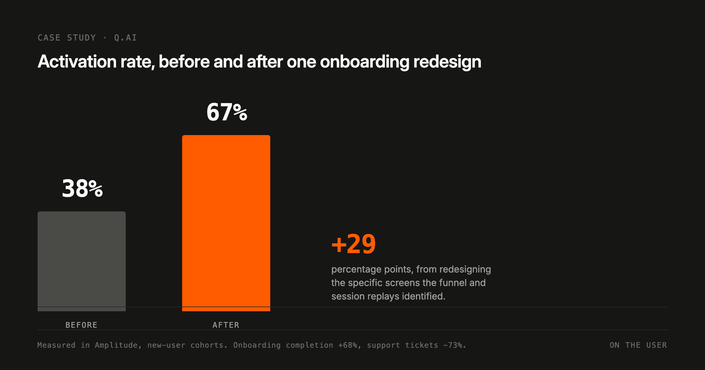
Q.AI activation rate, before and after. Measured by On the User in Amplitude across new-user cohorts.
Metric | Result |
|---|---|
Activation rate | 38% to 67%, a 29 point rise |
Onboarding completion | +68% |
Support tickets | −73% |
WHAT NEXT
Want this fixed in your product, not just explained?



Jul 11, 2026
By Victor Teran
How Q.AI Took Activation From 38% to 67% in One Onboarding Fix
Q.AI came to us with a problem most funded founders will recognize: a growing user base and a retention curve nobody could explain. Acquisition worked. The product was strong.
Case Study
Activation
Onboarding
And still, too many new users arrived, looked around, and never came back, while the team debated theories without data to referee them.
One growth audit later, the theories were replaced by a diagnosis: onboarding was breaking at specific, identifiable screens. We measured activation in Amplitude, against a market where only 4.6% of apps reach $10K monthly revenue in two years. We redesigned those screens based entirely on what the data said. Activation rose from 38% to 67%, onboarding completion rose 68%, and support tickets fell 73%. Q.AI ran for two more years and was acquired by Forbes. This is the anatomy of that engagement, written as a template you can run on your own product.
Key takeaways
Instrument first, judge later: a funnel over the new-user path, session replays at the break point, and a refusal to redesign anything until the data pointed somewhere.
Only the implicated screens, redesigned to remove the observed stumbles: value earlier, decisions fewer, next steps unmistakable.
Activation 38% to 67%, onboarding completion +68%, support tickets −73%. The numbers are specific to Q.AI; the method is not.
What did the diagnosis actually involve?
Instrument first, judge later: a funnel over the new-user path, session replays at the break point, and a refusal to redesign anything until the data pointed somewhere.
The first weeks contained no design work at all. Their stack was Amplitude, and the tool never matters: what went in was a funnel across the new-user journey: signup, the onboarding steps, first core action, return session. The funnel did what funnels do: it showed the cliff, the onboarding steps where survival fell hardest.
Then came the part that turns a chart into a diagnosis: session replays filtered to new users who hit those steps and left. Watching real people fail is humbling and clarifying in equal measure. The stumbles were concrete: moments where the flow demanded effort before showing value, screens where the next step was not obvious, a sequence that made sense to the team and not to a stranger.
The output of the diagnosis phase was deliberately small: a shortlist of specific screens, each with an observed failure attached. No moodboards, no full-product critique. A work order.
FREE GUIDE
The 4 product leaks costing you growth
A short audit guide for founders. Find the four places your product leaks revenue, and what to fix first.
What changed in the redesign?
Only the implicated screens, redesigned to remove the observed stumbles: value earlier, decisions fewer, next steps unmistakable.
The redesign touched the onboarding flow and the key screens around it, and nothing else. The principles were unglamorous. Show value before asking for effort. Cut every field and decision that could be deferred. Make the next action the loudest thing on the screen. Let a new user reach the product's core value in their first session, not their third.
Because the changes were narrow, attribution stayed clean. The rest of the product was held constant, so when the numbers moved, we knew why. This is the quiet advantage of surgical work over sweeping redesigns: the experiment is legible, and what you learn compounds into the next fix.
The measurement plan was agreed before shipping: same funnel, same steps, new cohorts against old. No cherry-picking windows, no switching metrics after the fact.
What were the results, and what generalizes?
Activation 38% to 67%, onboarding completion +68%, support tickets −73%. The numbers are specific to Q.AI; the method is not.
The numbers moved almost immediately. Activation rate from 38% to 67%, a 29 point rise. Onboarding completion up 68%. Support tickets down 73%, which surprised the team most and should not have: confused users file tickets, and the redesign removed the confusion at its source. Q.AI kept growing and was later acquired by Forbes.
What generalizes is not the percentages, it is the sequence. Instrument before judging. Let the funnel name the place. Let replays name the reason. Redesign only what the evidence implicates. Measure on the same yardstick you diagnosed with. In almost every product we have audited since, the biggest lever sat in the first minutes of the experience, exactly where it sat for Q.AI.
The other lesson: it was never the whole app. It was one flow, findable in the data, fixable in one focused engagement.
If you want this run on your own product, the entry point is a free 30-minute Growth Teardown: we look at your app and your analytics live, and you leave knowing your single highest-impact fix. Book your teardown.
Q.AI activation rate, before and after. Measured by On the User in Amplitude across new-user cohorts.
Metric | Result |
|---|---|
Activation rate | 38% to 67%, a 29 point rise |
Onboarding completion | +68% |
Support tickets | −73% |
WHAT NEXT
Want this fixed in your product, not just explained?
Jul 11, 2026
By Victor Teran
How Q.AI Took Activation From 38% to 67% in One Onboarding Fix
Q.AI came to us with a problem most funded founders will recognize: a growing user base and a retention curve nobody could explain. Acquisition worked. The product was strong.
Case Study
Activation
Onboarding
And still, too many new users arrived, looked around, and never came back, while the team debated theories without data to referee them.
One growth audit later, the theories were replaced by a diagnosis: onboarding was breaking at specific, identifiable screens. We measured activation in Amplitude, against a market where only 4.6% of apps reach $10K monthly revenue in two years. We redesigned those screens based entirely on what the data said. Activation rose from 38% to 67%, onboarding completion rose 68%, and support tickets fell 73%. Q.AI ran for two more years and was acquired by Forbes. This is the anatomy of that engagement, written as a template you can run on your own product.
Key takeaways
Instrument first, judge later: a funnel over the new-user path, session replays at the break point, and a refusal to redesign anything until the data pointed somewhere.
Only the implicated screens, redesigned to remove the observed stumbles: value earlier, decisions fewer, next steps unmistakable.
Activation 38% to 67%, onboarding completion +68%, support tickets −73%. The numbers are specific to Q.AI; the method is not.
What did the diagnosis actually involve?
Instrument first, judge later: a funnel over the new-user path, session replays at the break point, and a refusal to redesign anything until the data pointed somewhere.
The first weeks contained no design work at all. Their stack was Amplitude, and the tool never matters: what went in was a funnel across the new-user journey: signup, the onboarding steps, first core action, return session. The funnel did what funnels do: it showed the cliff, the onboarding steps where survival fell hardest.
Then came the part that turns a chart into a diagnosis: session replays filtered to new users who hit those steps and left. Watching real people fail is humbling and clarifying in equal measure. The stumbles were concrete: moments where the flow demanded effort before showing value, screens where the next step was not obvious, a sequence that made sense to the team and not to a stranger.
The output of the diagnosis phase was deliberately small: a shortlist of specific screens, each with an observed failure attached. No moodboards, no full-product critique. A work order.
FREE GUIDE
The 4 product leaks costing you growth
A short audit guide for founders. Find the four places your product leaks revenue, and what to fix first.
What changed in the redesign?
Only the implicated screens, redesigned to remove the observed stumbles: value earlier, decisions fewer, next steps unmistakable.
The redesign touched the onboarding flow and the key screens around it, and nothing else. The principles were unglamorous. Show value before asking for effort. Cut every field and decision that could be deferred. Make the next action the loudest thing on the screen. Let a new user reach the product's core value in their first session, not their third.
Because the changes were narrow, attribution stayed clean. The rest of the product was held constant, so when the numbers moved, we knew why. This is the quiet advantage of surgical work over sweeping redesigns: the experiment is legible, and what you learn compounds into the next fix.
The measurement plan was agreed before shipping: same funnel, same steps, new cohorts against old. No cherry-picking windows, no switching metrics after the fact.
What were the results, and what generalizes?
Activation 38% to 67%, onboarding completion +68%, support tickets −73%. The numbers are specific to Q.AI; the method is not.
The numbers moved almost immediately. Activation rate from 38% to 67%, a 29 point rise. Onboarding completion up 68%. Support tickets down 73%, which surprised the team most and should not have: confused users file tickets, and the redesign removed the confusion at its source. Q.AI kept growing and was later acquired by Forbes.
What generalizes is not the percentages, it is the sequence. Instrument before judging. Let the funnel name the place. Let replays name the reason. Redesign only what the evidence implicates. Measure on the same yardstick you diagnosed with. In almost every product we have audited since, the biggest lever sat in the first minutes of the experience, exactly where it sat for Q.AI.
The other lesson: it was never the whole app. It was one flow, findable in the data, fixable in one focused engagement.
If you want this run on your own product, the entry point is a free 30-minute Growth Teardown: we look at your app and your analytics live, and you leave knowing your single highest-impact fix. Book your teardown.
Q.AI activation rate, before and after. Measured by On the User in Amplitude across new-user cohorts.
Metric | Result |
|---|---|
Activation rate | 38% to 67%, a 29 point rise |
Onboarding completion | +68% |
Support tickets | −73% |
WHAT NEXT