Tokemak
We helped Tokemak redesign their product after our UX audit — we deliverd a design system aligned to their brand leading to the V2 of the protocol resulting in +$75M in TVL.
UX Audit
Design System
Branding
Crypto
Know More
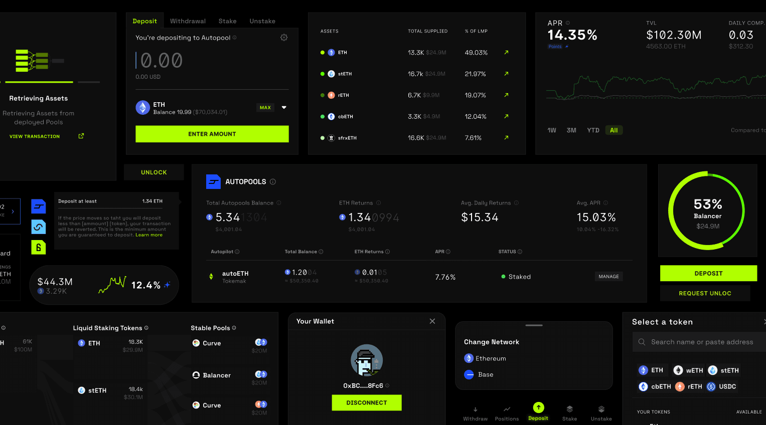
Yield on Autopilot across DeFi
Tokemak is a decentralized liquidity protocol that simplifies how liquidity is sourced, routed, and optimized across DeFi. Built as a first-of-its-kind liquidity aggregator, Tokemak empowers users to deploy capital efficiently—without needing to manage individual pools or strategies. By abstracting the complexity of liquidity provision, Tokemak creates a smarter, more accessible entry point into the DeFi ecosystem.
Impact
+$80M in TVL
+234% increase on unique visitors.
+$25M USDC deposits in two weeks.
$150k Revenue Distributed ion the first month.
Problem
A powerful protocol buried under UX complexity
Tokemak was building something bold: a new way to manage DeFi liquidity through a single, intelligent aggregator. But while the tech was groundbreaking, the product experience wasn’t keeping up. New users struggled to understand what Tokemak actually did, and experienced users were frustrated by fragmented flows, inconsistent UI, and unclear next steps. The complexity Tokemak aimed to eliminate was resurfacing in the interface itself.
Solution
We simplified the complex—and made it feel intuitive with a new Design System
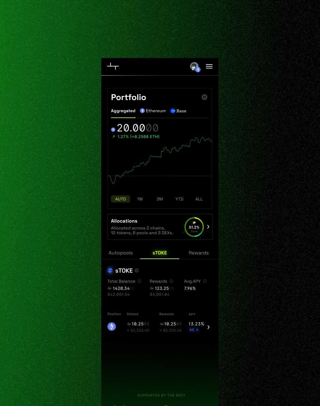
We began with a UX audit of Tokemak’s first version—untangling core flows and mapping how users moved from token selection to allocation. Early on, it became clear: to let the new product shine, we needed a scalable design system that brought consistency across the experience.
Our goal was to eliminate friction without dumbing things down. Through iterative prototyping and user validation, we rebuilt the interface around clarity, context, and actionable next steps. Smart defaults, streamlined architecture, and a refined visual system made the protocol’s sophistication feel accessible—not overwhelming. With a flexible system in place, Tokemak could now evolve without sacrificing usability.
Our Accomplishments
$80M in TVL and great product experience
The new Tokemak experience didn’t just look better—it performed. Within weeks of launch, the platform saw a $25M surge in ETH deposits, also $31M in USDC deposits and over $80M in TVL, and $150K in revenue distributed in the first month to the stakers. Unique visitors grew by 234%, driven by a clearer narrative and a smoother product experience aligned with the rebranding and adquisition channels.
But the real win? Users finally got it. Our Liquidity Flow UI became a standout feature—praised for making a complex protocol instantly understandable. A once-intimidating product became approachable, trusted, scalable and sharable.
Ready to build?
Get your idea executed or your product audited for growth.
Copyright © On the User 2025
All Rights Reserved
More Works
OTU
©2025

FAQ
01
What does a project look like?
02
How is the pricing structure?
03
What type of industries you work with?
04
What is the ROI?
05
Why should I choose OTU® over a freelancer or design agency?
06
How quickly can we get started?
Tokemak
We helped Tokemak redesign their product after our UX audit — we deliverd a design system aligned to their brand leading to the V2 of the protocol resulting in +$75M in TVL.
UX Audit
Design System
Branding
Crypto
Know More
Yield on Autopilot across DeFi
Tokemak is a decentralized liquidity protocol that simplifies how liquidity is sourced, routed, and optimized across DeFi. Built as a first-of-its-kind liquidity aggregator, Tokemak empowers users to deploy capital efficiently—without needing to manage individual pools or strategies. By abstracting the complexity of liquidity provision, Tokemak creates a smarter, more accessible entry point into the DeFi ecosystem.
Impact
+$80M in TVL
+234% increase on unique visitors.
+$25M USDC deposits in two weeks.
$150k Revenue Distributed ion the first month.
Problem
A powerful protocol buried under UX complexity
Tokemak was building something bold: a new way to manage DeFi liquidity through a single, intelligent aggregator. But while the tech was groundbreaking, the product experience wasn’t keeping up. New users struggled to understand what Tokemak actually did, and experienced users were frustrated by fragmented flows, inconsistent UI, and unclear next steps. The complexity Tokemak aimed to eliminate was resurfacing in the interface itself.
Solution
We simplified the complex—and made it feel intuitive with a new Design System
We began with a UX audit of Tokemak’s first version—untangling core flows and mapping how users moved from token selection to allocation. Early on, it became clear: to let the new product shine, we needed a scalable design system that brought consistency across the experience.
Our goal was to eliminate friction without dumbing things down. Through iterative prototyping and user validation, we rebuilt the interface around clarity, context, and actionable next steps. Smart defaults, streamlined architecture, and a refined visual system made the protocol’s sophistication feel accessible—not overwhelming. With a flexible system in place, Tokemak could now evolve without sacrificing usability.
Our Accomplishments
$80M in TVL and great product experience
The new Tokemak experience didn’t just look better—it performed. Within weeks of launch, the platform saw a $25M surge in ETH deposits, also $31M in USDC deposits and over $80M in TVL, and $150K in revenue distributed in the first month to the stakers. Unique visitors grew by 234%, driven by a clearer narrative and a smoother product experience aligned with the rebranding and adquisition channels.
But the real win? Users finally got it. Our Liquidity Flow UI became a standout feature—praised for making a complex protocol instantly understandable. A once-intimidating product became approachable, trusted, scalable and sharable.
Ready to build?
Get your idea executed or your product audited for growth.
Copyright © On the User 2025
All Rights Reserved
More Works
OTU
©2025
FAQ
01
What does a project look like?
02
How is the pricing structure?
03
What type of industries you work with?
04
What is the ROI?
05
Why should I choose OTU® over a freelancer or design agency?
06
How quickly can we get started?
Tokemak
We helped Tokemak redesign their product after our UX audit — we deliverd a design system aligned to their brand leading to the V2 of the protocol resulting in +$75M in TVL.
UX Audit
Design System
Branding
Crypto
Know More
Yield on Autopilot across DeFi
Tokemak is a decentralized liquidity protocol that simplifies how liquidity is sourced, routed, and optimized across DeFi. Built as a first-of-its-kind liquidity aggregator, Tokemak empowers users to deploy capital efficiently—without needing to manage individual pools or strategies. By abstracting the complexity of liquidity provision, Tokemak creates a smarter, more accessible entry point into the DeFi ecosystem.
Impact
+$80M in TVL
+234% increase on unique visitors.
+$25M USDC deposits in two weeks.
$150k Revenue Distributed ion the first month.
Problem
A powerful protocol buried under UX complexity
Tokemak was building something bold: a new way to manage DeFi liquidity through a single, intelligent aggregator. But while the tech was groundbreaking, the product experience wasn’t keeping up. New users struggled to understand what Tokemak actually did, and experienced users were frustrated by fragmented flows, inconsistent UI, and unclear next steps. The complexity Tokemak aimed to eliminate was resurfacing in the interface itself.
Solution
We simplified the complex—and made it feel intuitive with a new Design System
We began with a UX audit of Tokemak’s first version—untangling core flows and mapping how users moved from token selection to allocation. Early on, it became clear: to let the new product shine, we needed a scalable design system that brought consistency across the experience.
Our goal was to eliminate friction without dumbing things down. Through iterative prototyping and user validation, we rebuilt the interface around clarity, context, and actionable next steps. Smart defaults, streamlined architecture, and a refined visual system made the protocol’s sophistication feel accessible—not overwhelming. With a flexible system in place, Tokemak could now evolve without sacrificing usability.
Our Accomplishments
$80M in TVL and great product experience
The new Tokemak experience didn’t just look better—it performed. Within weeks of launch, the platform saw a $25M surge in ETH deposits, also $31M in USDC deposits and over $80M in TVL, and $150K in revenue distributed in the first month to the stakers. Unique visitors grew by 234%, driven by a clearer narrative and a smoother product experience aligned with the rebranding and adquisition channels.
But the real win? Users finally got it. Our Liquidity Flow UI became a standout feature—praised for making a complex protocol instantly understandable. A once-intimidating product became approachable, trusted, scalable and sharable.
Ready to build?
Get your idea executed or your product audited for growth.
Copyright © On the User 2025
All Rights Reserved
More Works
©2025
FAQ
What does a project look like?
How is the pricing structure?
What type of industries you work with?
What is the ROI?
Why should I choose OTU® over a freelancer or design agency?
How quickly can we get started?